Have you ever stopped to think about why some websites just seem to click with you, while others leave you feeling a bit lost? Well, let me introduce you to the magic of visual hierarchy — it’s like the secret ingredient that makes a design stand out in the crowd!
So, what exactly is visual hierarchy, you ask? Think of it as the tour guide of the design world, leading your eyes on a journey through the digital landscape. It’s all about arranging elements in a way that makes the most important stuff pop, whether it’s a catchy headline, a stunning image, or a tempting call-to-action button.
But visual hierarchy isn’t just about grabbing attention; it’s also about making life easier for your visitors. Imagine you’re on a mission to find some crucial info on a website. You wouldn’t want to waste time searching high and low, right? That’s where hierarchy swoops in to save the day—it’s like your trusty map, guiding you straight to the treasure trove of information you seek.
Now, let’s dive into some of the nifty tricks designers use to create this magical hierarchy. Ever heard of the rule of thirds? It’s like the secret sauce that adds just the right amount of flavour to your design, creating balance and harmony. And then there’s typography, colour, and contrast—all working together like a well-oiled machine to make your content shine brighter than a summer day.
The visual hierarchy has 7 important principles. These principles help construct a visual hierarchy to keep visitors engaged and informed. I will show just a few examples of those rules and how to change the design perspective
1. Reading patterns
There are two primary reading layouts: Z pattern and F pattern. These support visitors’ natural reading habits — which for most people in Western cultures is left to right — by strategically placing information to tell a cohesive story that makes sense to visitors.
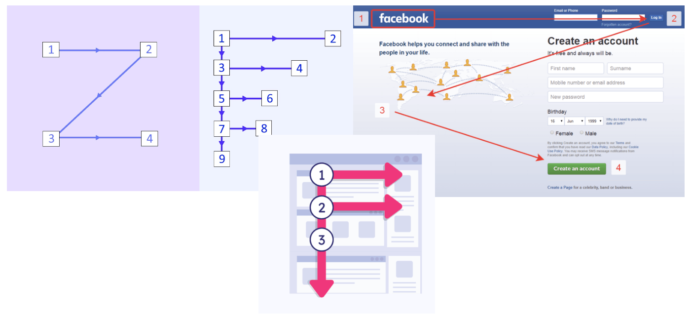
2. Rule of thirds
The rule of thirds is based on a grid pattern that breaks a rectangle horizontally and vertically into thirds. This creates four points of intersection on the grid. Placing items at one, some, or all of these points creates visual interest without disrupting the balance.

Oh, and let’s not forget about white space—the unsung hero of design. It’s like a breath of fresh air in a cluttered room, giving your layout room to breathe and your visitor’s room to think.
Examples:

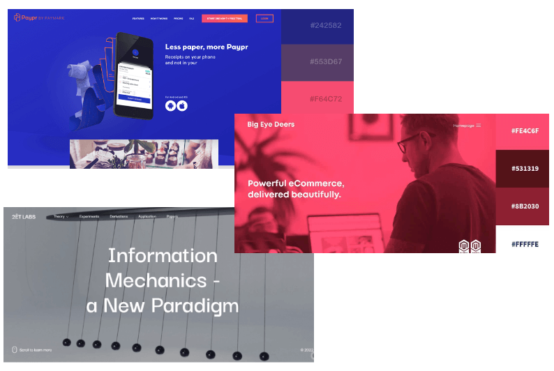
Below are more examples of Typography, Scale, Size and Colour, and Contrast with repetition that make the website consistent.
So, the next time you’re tinkering away on a website or crafting a dazzling infographic, remember the power of visual hierarchy. It’s not just about making things look pretty (although that’s definitely a plus)—it’s about making them work seamlessly too. I hope this article has shed some light on the importance of visual hierarchy and how it can enhance your understanding of design principles.