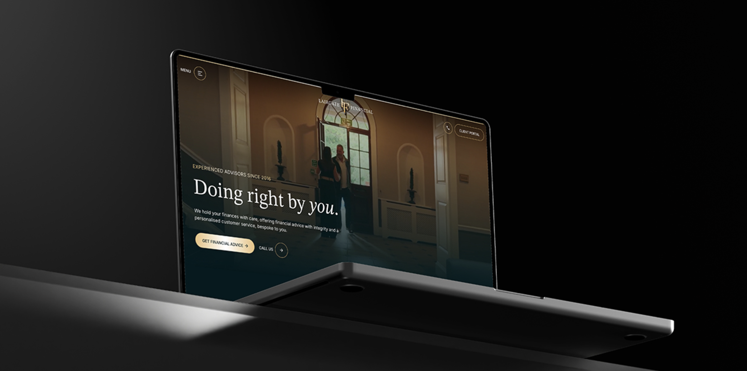
When a website doesn’t convert it’s generally down to how content is displayed, will it engage the user and will it create an impact to get that enquiry or purchase? Lairgate Financial’s website was great, but these areas were missing to really make it perform in the way it deserves.
That’s where Superfly came on board.
In this case, what did we do to help?
- Strong social proof throughout, turns users from thinking about enquiring to picking up the phone immediately.5.0 Google ratings – All reviews 5-star? Why not showcase that? Google especially proves to potential clients you’re a trustworthy company, so the client is in safe hands.Reviews directly from Google or other platforms – A random selection of positive reviews can go a long way. Trustpilot, Yell and Feefo are also great options.
- Now we have all the social proof needed, we had to consider how the company will benefit them, what makes them different to other financial firms across the UK? What is the company’s USP?
Strong brand identity – This makes the website personal to Lairgate, avoiding generic graphics loses the brand’s soul and puts doubts in people’s mind whether they should be trusted. A list of benefits explains why you should arrange a consultation and what you can expect during the process.
Faces behind the company – This is an important factor most websites lack, who are you actually dealing with in each sector? Get to know the people before enquiring, on a work and personal level.
Call to actions present throughout – Finding the right balance between overdoing it or underselling is crucial for the business and their conversions. The placement should be in areas the user begins to think about enquiring. So for example, above the footer, or below sections that explain their purpose or expertise. That’s what will convert. Prioritise the primary call to action in the header so it’s present no matter where people are on the page, making it easily accessible.
FAQ Groups – Not many companies have these but if they do, use them! Incorporating a list of FAQs will potentially answer a question before a user picks up the phone. Ensuring that your concerns are covered with this company moving forward.
Ways to reach out – Having a contact form is great, but it generally depends on what’s easier for the user. A registered address for people who can’t do that team’s call. Options to email or call if needed.
So, what next?
We now have the main aspects that will drive enquiries. Now we plan the aesthetic. How can we tie the website in with the new brand? How can we make this visually engaging? Both for the user journey and the eye.
With strict brand guidelines in place we used what’s called the 60-30-10 rule. This ensures the colour palette is used effectively, causing no contrast or accessibility issues. Never clash two colours together, select one primary (in this case, off black) and then use the secondary colour (gold) as an accent. Here’s a rough breakdown.
- 60% – Most of the websites background colour, text colour on lighter sections.
- 30% – Additional sections to break up the darkness, accent elements such as buttons, sub headings, star rating etc.
- 10% – Any other colour that’s required but with less use than the above.
Heard enough? If you’d like to see this website in action, visit the live website here.